Monday 20 February 2012

International Women's Day Poster

So my Poster for International Women's day has finally been finished. Behold:


POSTER3

Also for you too look at are some earlier versions of this poster. One when I first began painting it:

Poster1

And another shot of the final image fully painted (But without any digital touch-ups):


poster2

Illustration Friday: Popularity

Popularity2

 So this week's word for Illustration Friday is "Popularity" and I immediately got the idea to design an image that looked like a fake yearbook. I decided to use four characters I've been using for a comic side-project I've been working on in my spare time as I really wanted to get some more practice in drawing them.

My inspiration for this particular piece was the illustrations of Bill Tara. Now the major focus of most of the images of his I've come across are cars but you can obviously tell I didn't incorporate this aspect into my work: Rather what interested me more was the way he used line and the simplicity with which he drew his figures


Tara01

To create this illustration I started, as always, with a series of thumbnails:


Followed by rough drawings of the individual characters:


Put them all together and added some colour:


And finally put the whole thing together in the yearbook format


Monday 13 February 2012

Illustration Friday: Suspense!

This week's word for Illustration Friday is Suspense. This immediately made me think of those old, sensationalistic horror and thriller comics from the 1950s; stuff like Tales from the Crypt and the like. So my idea for this week's illustration was to create a mocked up comic book cover.


SUSPENSE4

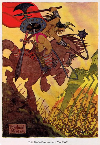
Now, for this particular illustration I drew from a wide variety of inspirations but my starting point was the work of Rowland B Wilson: A mid century cartoonist, animator and illustrator who has done a work for such varied companies as Disney, Esquire, the New Yorker and Playboy. Not only did looking at his work give me an idea for the subject matter (That being high fantasy) but also the soft, textured, painterly technique I decided to use to illustrate it.


Wilson15
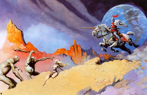
 Aside from Mr Wilson I would also end up drawing inspiration from artists Frank Frazetta and Maurice Noble. Many of you are probably familiar with Frazetta, if not in name then at least in the work he did: He was essentially the god of pulp and fantasy art. His work essentially canonized the aesthetic adapted by fantasy artists in the mid 20th century. The bold, contrasting colours, loose painterly style and focus on geometrical/textured background elements were all elements that I tried to incorporate into my illustration


1259728429569

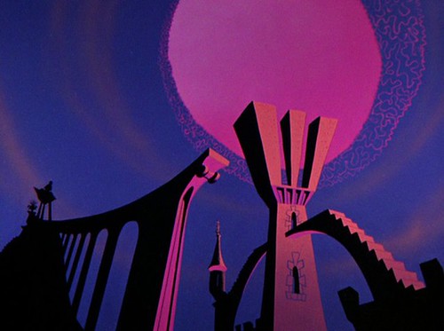
 Maurice Noble is also an artist whose work many of you may be familiar with without being aware of it. He was one of the primary background artists for Warner Brother animation studios through the 1940s and 50s working primarily under director Chuck Jones. His backgrounds were characterized by bright, pinkish-hued colours, strange geometric forms and heavily distorted perspective. He provided the background art for such animated shorts as Duck Dodgers in the 24th 1/2 century and What's Opera, Doc?


MauriceNobleBackground

 My process for creating this particular piece was fairly straightforward. I began with thumbnails to try and work out ideas:

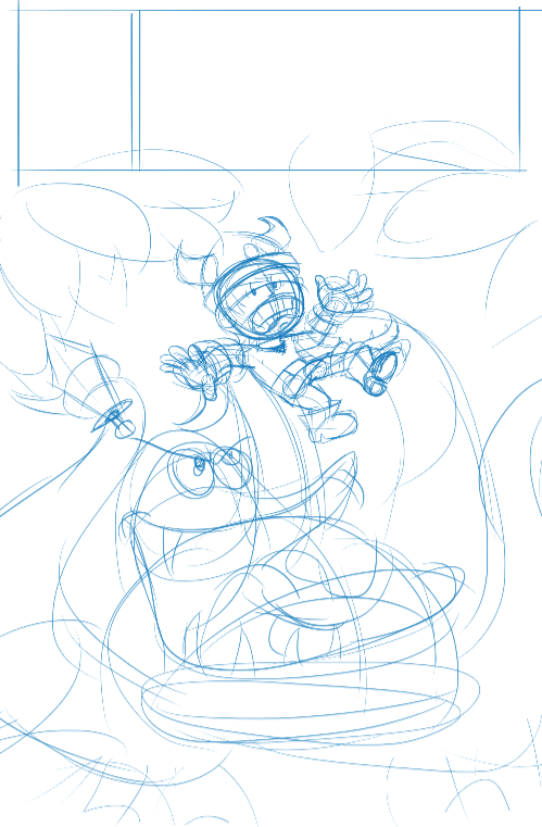
I liked the more literal interpretation the first two concepts gave to the term "Suspense" but I ultimately preferred the composition of the final thumbnail (And it would give me an opportunity to draw one of my favorite things: Old ruined architecture). From there I roughed out the layout of the thumbnail in full


 Then blocked in the base colours for the composition


 And rendered the final piece


 As a final touch I played around with the colours of the individual elements of the composition to maximize the contrast until I got a colour scheme I was happy and added the comic cover elements, with leaving me with the final products

SUSPENSE4

Tuesday 7 February 2012

Laptop Skin

Hey everybody,

I made a laptop skin featuring my old mainstays: Felix and Lucy.
SKYPILOT
I really like how the expressions came out on this one: Lucy is reckless and determined as ever while Felix is sort of being dragged along for the ride

Bits and Bobs

Hey everyone, sorry I haven't been posting much lately. I've been busy moving and haven't really had a chance to get on the internet. But I'm all moved into the new place and have almost settled in (The internet should be up by tomorrow night).

So I really just wanted to share this [url=http://nedroid.com/2009/05/color-me-surprised/]neat tutorial on colouring comics[/url] in Photoshop that Anthony Clark (Creator of [url=http://nedroid.com/]Nedroid[/url]) made about a year or two ago

Also I wanted to encourage everyone to check out the [url=http://torontocomics.com/]Toronto Comic Arts Festival[/url] this May. It's a great place to meet other artists and cartoonists and an even better place to make contacts.

Monday 6 February 2012

Illustration Friday: Forward!

Illustration Friday: Forward

So, this weeks theme for illustration Friday is the word "Forward".  Now this word immediately conjured up images of motion and movement and speed and that itself conjures up images of cars and hot rods. This sort of grew and developed into my idea to make a simple graphic of a furious cab driver caught in a traffic jam. I finally decided I'd use this design to design a coaster from the sort of ding dinner such a character would inhabit to tie everything together.

Now for this particular project I drew inspiration from three main sources, those being: The hot rod drawings of Ed "Big Daddy" Roth; The clean, simple linework of Ed Fischer; and, most specifically, a drawing of a monster truck drawn by Peter Bagge for the cover of one of the issues of his comic HATE.


So from there I went on to draw up some thumbnails:


You can see the big influence Roth's work had on the third thumbnail, though in the end I settled on the first thumbnail idea as I felt it had the best synergy with the typography.

From there I moved on to the rough drawings:


When I had my drawing worked up to the level I wanted I inked the final drawing:


And finally rendered that drawing to look like a coaster from some sort of greasy truck stop: